
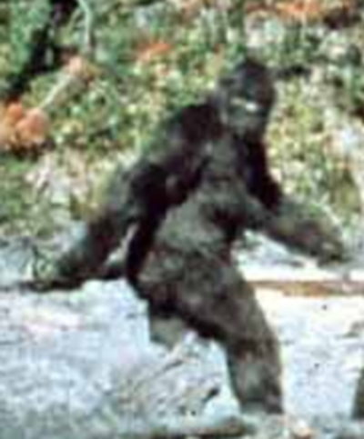
The website I chose to critique is the Bigfoot one, Sasquatch. I looked through the one on crop circles, but the background made me dizzy, so I decided to go with Bigfoot! I find this topic a little more off the wall and interesting than that of crop circles. Right now, it is known that people “fake” them (circle art; people go into fields and are paid to make a crop circle design). But with Bigfoot, the field is newer; all the genetic research in the field can someday soon prove or disprove if he really exists.
Anyhow, time for the analyzing. Like I stated above, the previous site seemed a jumble in my eye, the graphics detracted too much and made everything really messy and chaotic(which might be what the designers were going for, but I did not like it), so this site seemed much calmer and better organized. The background is a pure black with the center row holding all of the information necessary for navigation. Everything is lined up in the center of the page, so the eye naturally flows downward in a list-type motion instead of looking all around for what comes next.
That is one of the things I liked best about this page layout. The graphics and texts flowed nicely together. Right off the bat you get an introduction on what the site is about and a cool video explaining the main issues. This makes it easier than having several long paragraphs or photos with captions. Then the site goes downward, following the natural line, listing the various sites and links it is centered around. For instance, recent Bigfoot sightings, where different conventions and sightings are being held, and frequently asked questions.
The photographs balance the text very well on this site. Each photo is balanced by a caption and or a link that takes viewers to a desired site that expresses the set opinion or idea. There is not too much clutter or an excessive amount of links on the page either. Each page worked together to get the message of Bigfoot across. The reader can click one link that brings him/her to a page very similar in layout to the first, main page. This limits confusion and helps a more uniform idea form. Also, the text was well formed. It was easy to see against the dark background and stood out, so that readers could clearly see what different links the site had to offer. The text was not hidden by the photos and did not seem to overly crowd the space. Though there were a lot of images, some of which could have probably made a new link page(like the calendar off to the left side), it was not bad.
Overall, the visual argument is well presented. The makers of the site offer clear statements to what they wish to show and accomplish. Each page is headed with a concise heading, the background information is all there, and the photos balance everything out for a visual experience that appears educated and professional.


1 comment:
this was helpful, I can tell, as your essay was very good Nichole. Nice image too - thanks
Post a Comment